
World Immigration Map
From the desk of Luc Van Braekel on Tue, 2006-04-11 12:47
The University of Sheffield has an interesting map of the world, where countries are resized in proportion to their net immigration figure. It is part of their World Mapper Project.
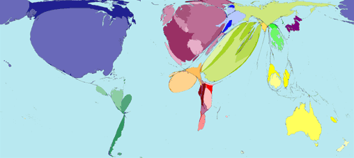
The US, Western Europe, and the Arabian Peninsula are dramatically larger. Italy can hardly be seen. And what is that large bubble in Northern Africa? Lybia? The Netherlands and Belgium are each almost as large as the UK, which might come as a surprise considering that sometimes illegal immigrants are caught on trucks in Belgium while on their way to the UK, which seems like the promised land to a lot of (illegal) immigrants.
But of course, this map does not tell everything. It only shows legal immigration, not the illegal part. Furthermore, in the US and on the Arabian peninsula, the needs of the economy are at the center of sophisticated immigration policies. In Western Europe, immigration is mostly centered around political asylum for refugees, and on the reunification of families. [Hat tip: e-mail from Matthias Storme]
Belgian map
Submitted by Johan Van Loon on Tue, 2006-04-11 21:47.
Which Flemish university will take on the challenge to create similar maps on the Belgian level ?
How about Belgian maps with smaller & larger cities according to (youth) unemployment, number of crimes, government employment,...
How wonderful wouldn't it be to see that Walloonia is much bigger on all these maps ?